Style Guide: Content Blocks
This page holds examples of the flexible page authoring tools present on this website. Additionally, there are a number of spacing options (for both desktop & mobile) in the Display Options dropdown for each block — consider these when creating any new page, keeping in mind that the desktop & mobile settings may want to be different, depending on the circumstances.
Images
Images
Caption field. (This image set to ‘small,’ which is good for headshots and other vertical images that might not need as much size on the page.)
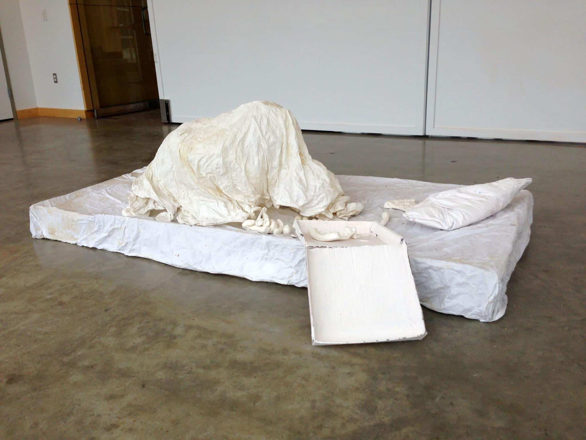
Caption field. (This image set to ‘text block’ width.)
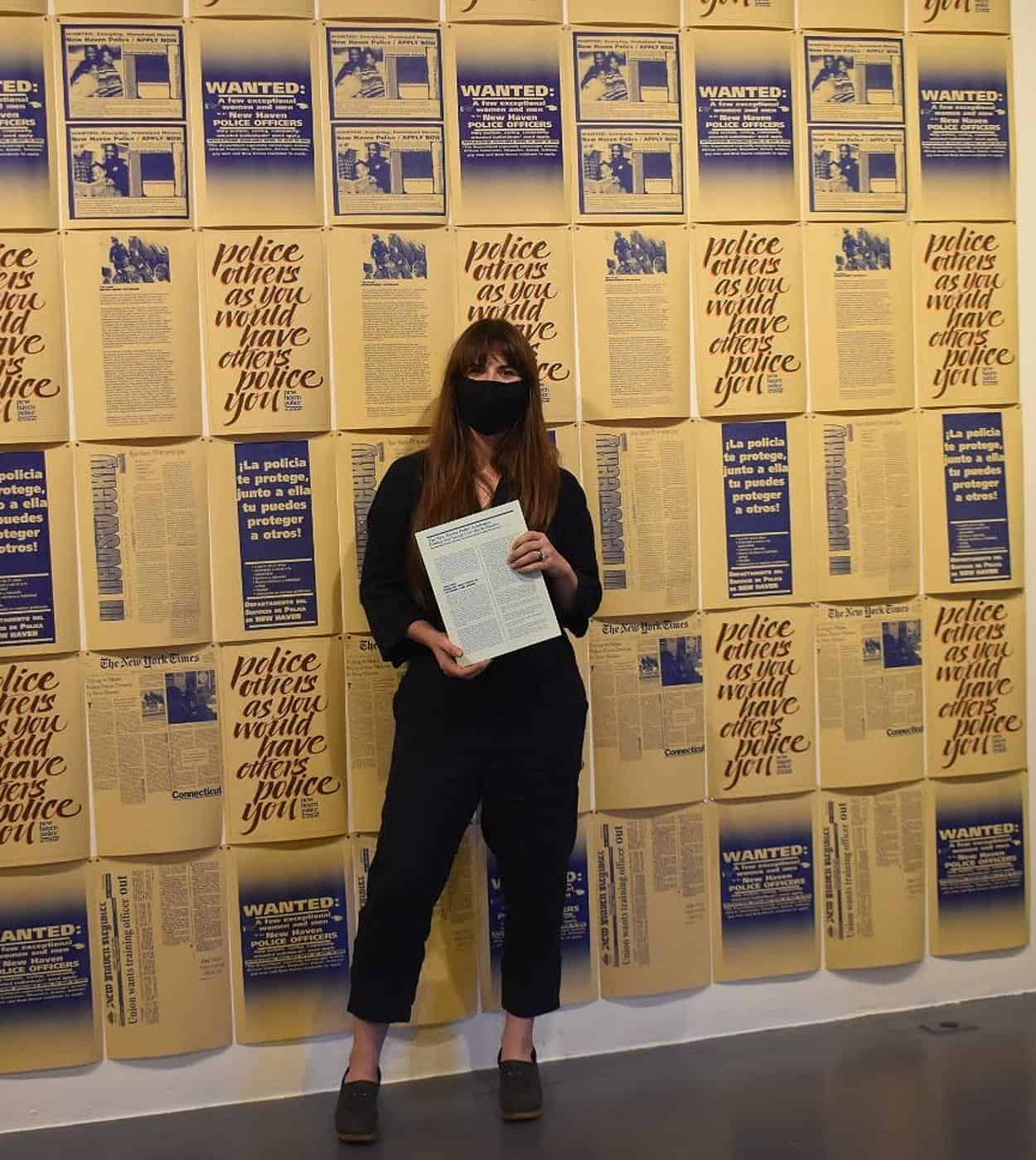
Caption field. (This image set to full-width.)
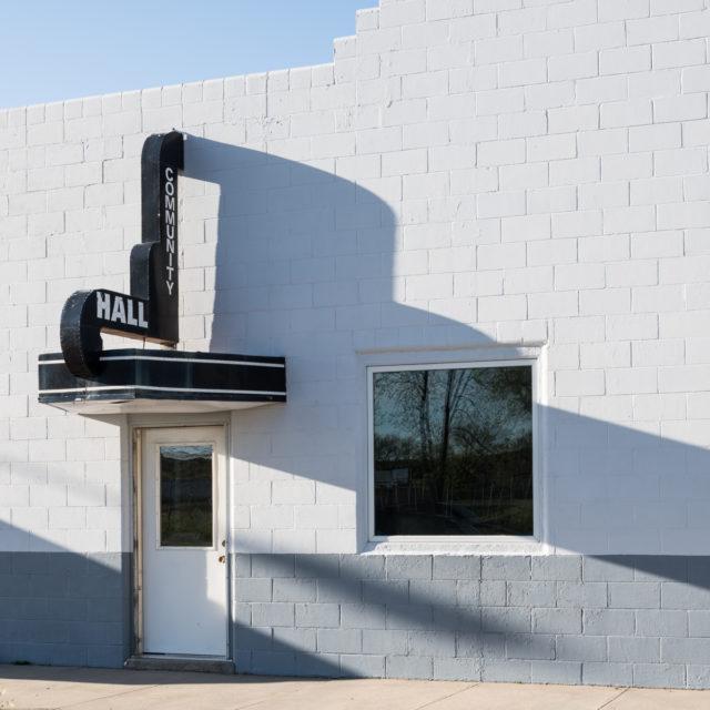
Caption field. (This image set to full-bleed.)

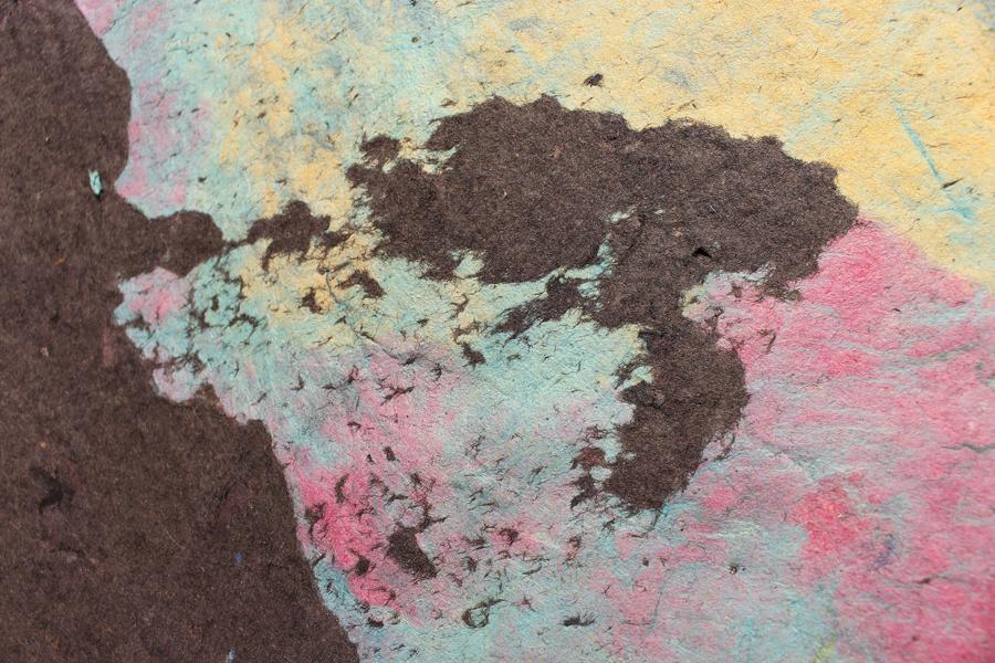
Caption field. (This image set to ‘full-bleed with masked shape,’ set to ‘Random.’)
Galleries
Galleries
There are two types of gallery formats available: ‘Inline’ and ‘Grid with pop-up.’ The pop-up gallery is most useful when there’s additional info to share for a given image: caption and description, for example.
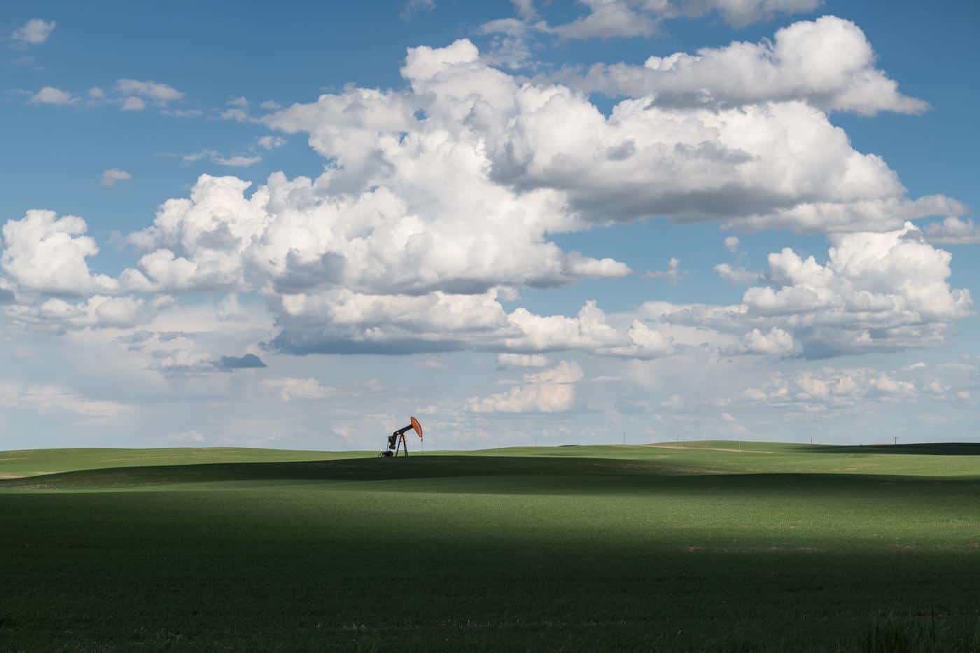

David Ottenstein, Pumpjack, Alberta, 2019. Archival pigment ink print, ed 1/10, 24 × 30 in.
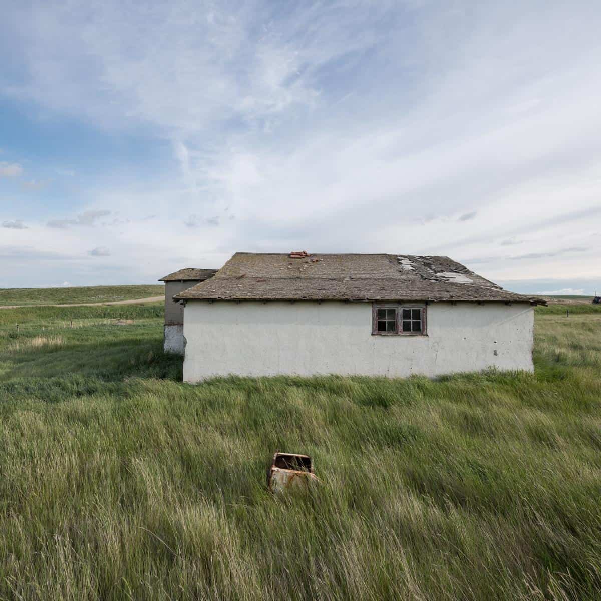
David Ottenstein, Stucco House, SW of Milk River, 2019. Archival pigment ink print, ed 1/10, 24 × 30 in.
David Ottenstein, Wandering, Bonneville Salt Flats, Utah, 2018. Archival pigment ink print, ed 1/20, 16 × 20 in.
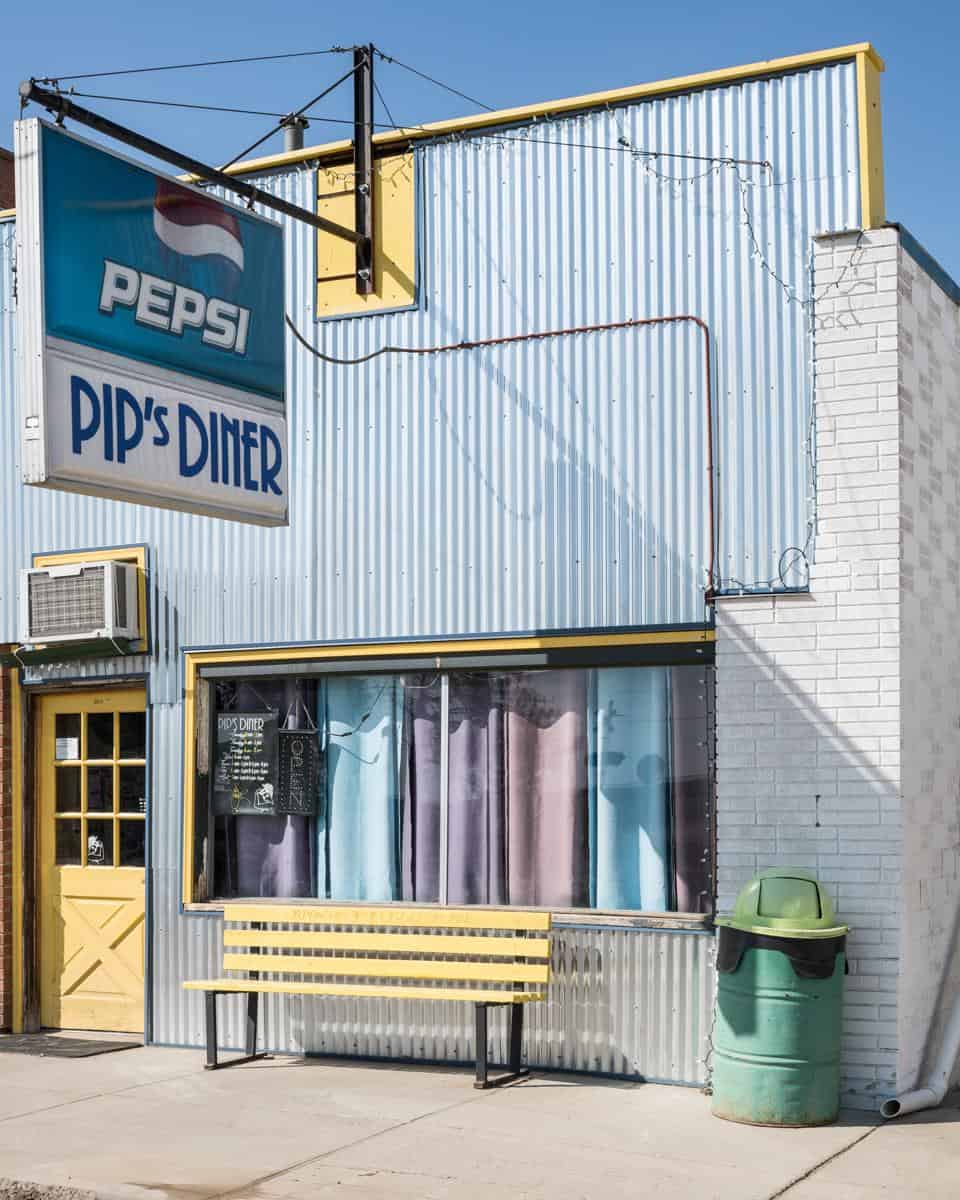
David Ottenstein, Pip’s Diner, Saco, Montana, 2019. Archival pigment ink print, ed 3/20, 16 × 20 in.
Grid Gallery with pop-up (H3)
Grid text on page (H3)
Credit line, if applicable

Grid text on page (H3)
Credit line, if applicable
Text
Text
The typeface in use for the body of most content types is Life LT Std Roman, set at 24 / 29 px on desktop and 18.5 / 23.5 px on mobile. Bolding any text in-line will switch the font to Artspace Black — use this bolding to draw attention to links or calls to action. To create a text button below a paragraph, just start a new paragraph and add a bold link:
A pullquote style is available under the “Formats” menu in the WYSIWYG toolbar. This will switch the font to Artspace Black and extend it out to the left of the text margin for emphasis.
Lorem ipsum dolor sit amet, consectetur adipiscing elit. Aenean eleifend lorem libero, ut finibus velit faucibus in. Nulla sit amet augue justo. Fusce id risus ut arcu bibendum porta placerat et eros. Nunc tincidunt justo ut lacinia elementum. Integer pellentesque eros eget dictum efficitur. Nullam non semper nibh. Donec ornare.
Heading 1
Heading 2
Heading 3
Heading 4
Heading 5
Accordion menu
An image field is available inside each accordion item. Lorem ipsum dolor sit amet, consectetur adipiscing elit. Aenean eleifend lorem libero, ut finibus velit faucibus in. Nulla sit amet augue justo. Fusce id risus ut arcu bibendum porta placerat et eros. Nunc tincidunt justo ut lacinia elementum. Integer pellentesque eros eget dictum efficitur. Nullam non semper nibh. Donec ornare.
The announcement block is used sparingly for closures and other time-sensitive or urgent communications. There is also a persistent announcement on the homepage that holds a call to support.
Grid text in pop-up (H2)
Credit line, if applicable
Lorem ipsum dolor sit amet, consectetur adipiscing elit. Aenean eleifend lorem libero, ut finibus velit faucibus in. Nulla sit amet augue justo. Fusce id risus ut arcu bibendum porta placerat et eros. Nunc tincidunt justo ut lacinia elementum. Integer pellentesque eros eget dictum efficitur. Nullam non semper nibh. Donec ornare.
Grid text in pop-up (H2)
Medium, Dimensions
Credit line, if applicable
Lorem ipsum dolor sit amet, consectetur adipiscing elit. Aenean eleifend lorem libero, ut finibus velit faucibus in. Nulla sit amet augue justo. Fusce id risus ut arcu bibendum porta placerat et eros. Nunc tincidunt justo ut lacinia elementum. Integer pellentesque eros eget dictum efficitur. Nullam non semper nibh. Donec ornare.